 Our first release
AppNexus Header Bidding
A new tool in the advertising technology industry (header bidding) made it easier for publishers to work with more sources of demand (advertising-lingo for sources of advertisements). AppNexus needed a simplified version of their enterprise product for smaller publishers to access our demand.
Our goal was to allow users to set up and understand AppNexus demand for header bidding without needing to work with account managers.
For this project I also lead a more collaborative design process with the engineering team. It lead to a greater appreciation of the role of design at AppNexus and a more polished shipped product.
Our first release
My Role
I was the the lead product designer on the project. Overall this included working with the research team, getting requirements from stakeholders, helping to plan the roadmap, and owning the final UX and visual design of the product.
Tasks
- Requirements gathering
- User journeys, User flows
- Setting the visual design strategy
- Setting the design strategy
- Leading Participatory design sessions
- Sketching, Wire-frames, Prototyping, Pixel perfect mockups
- Design reviews
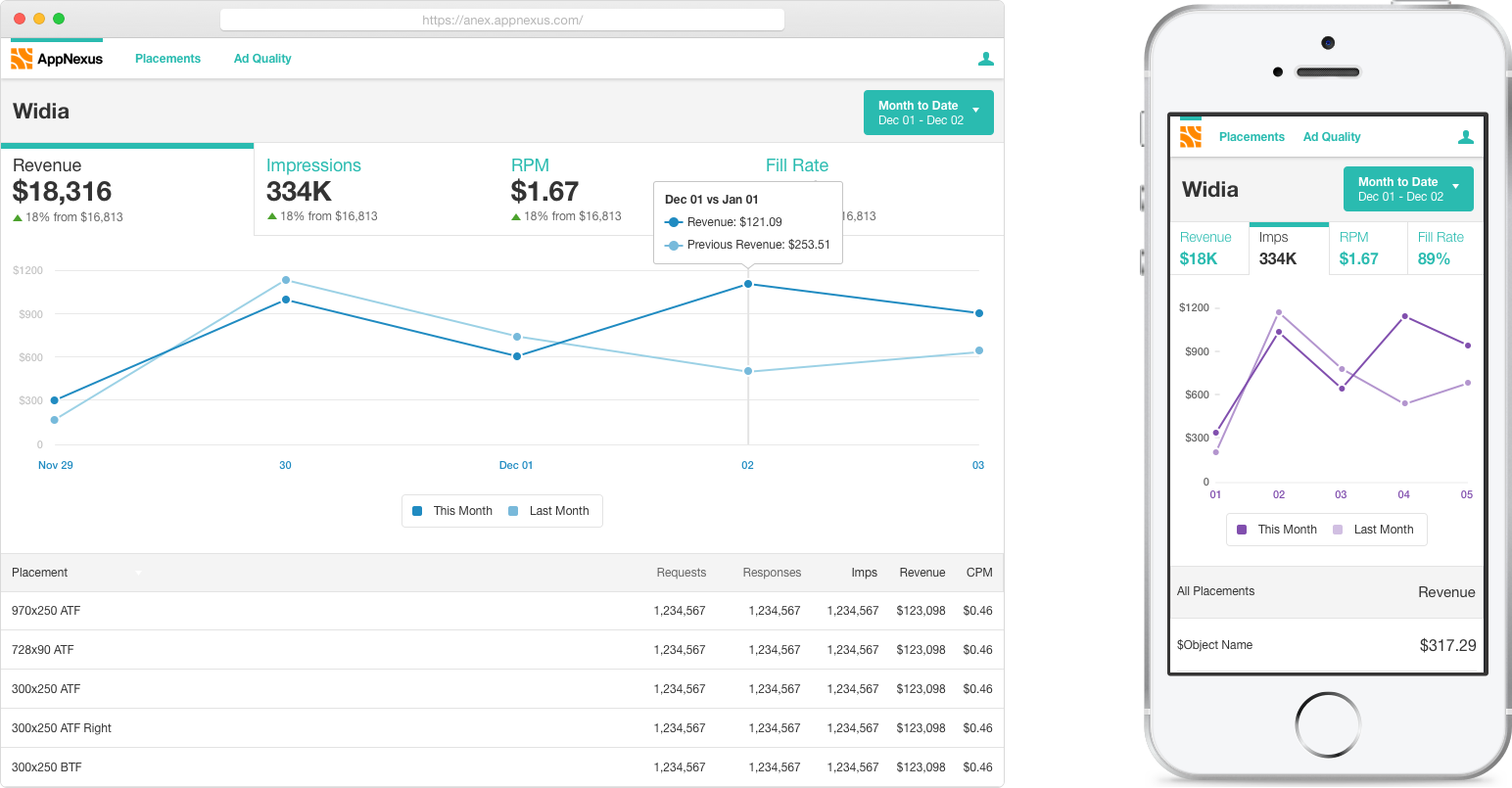
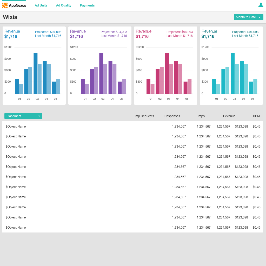
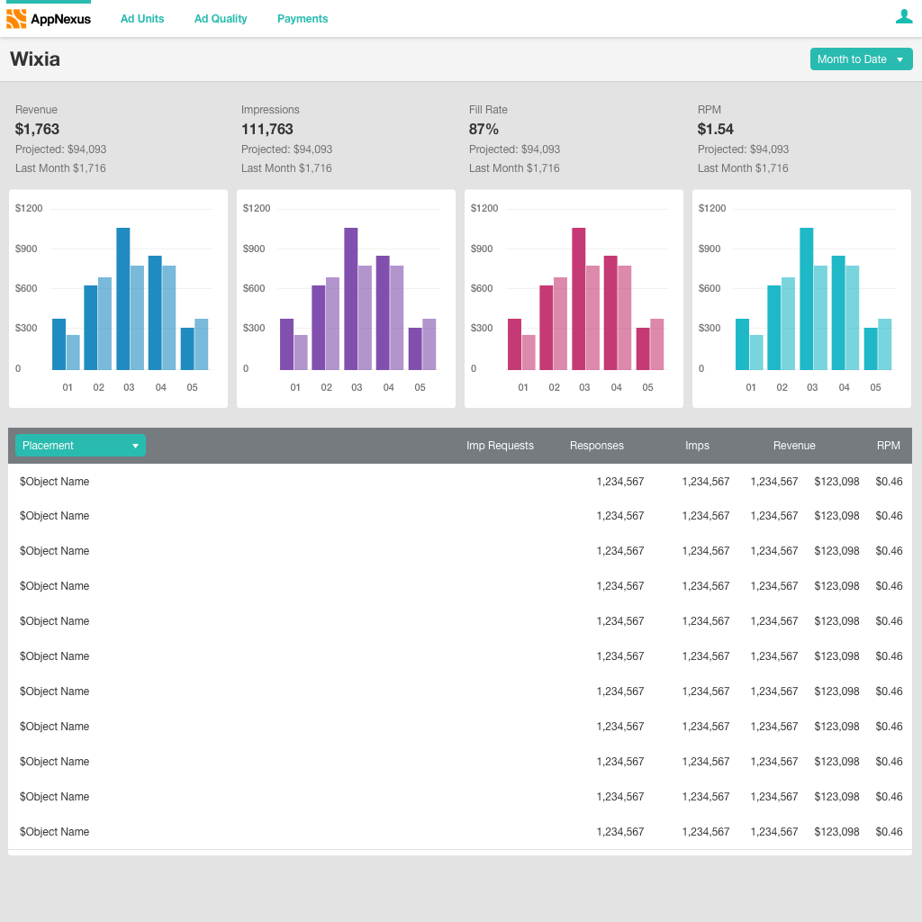
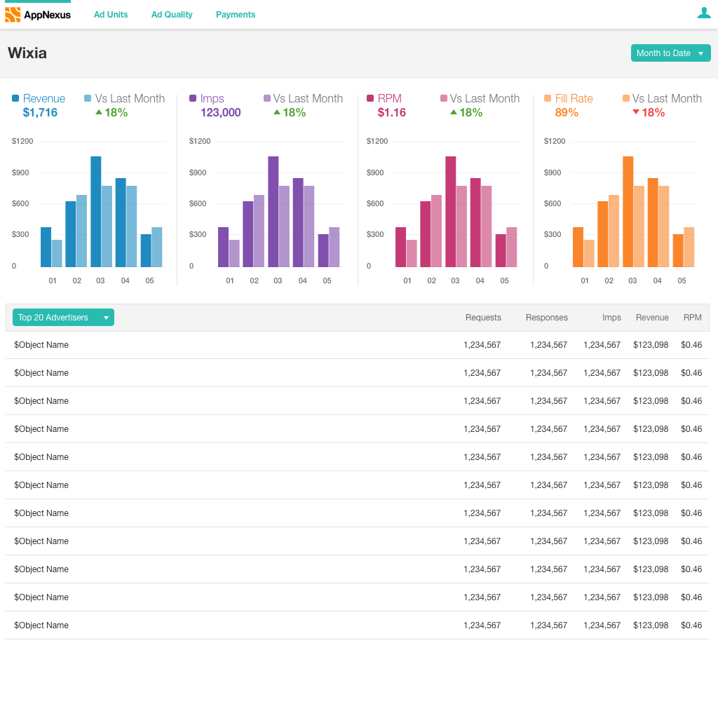
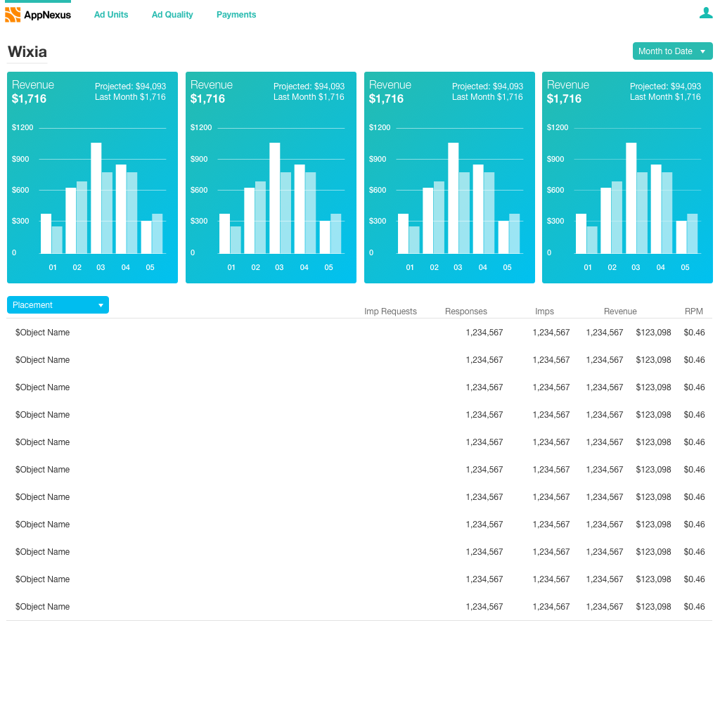
Dashboard
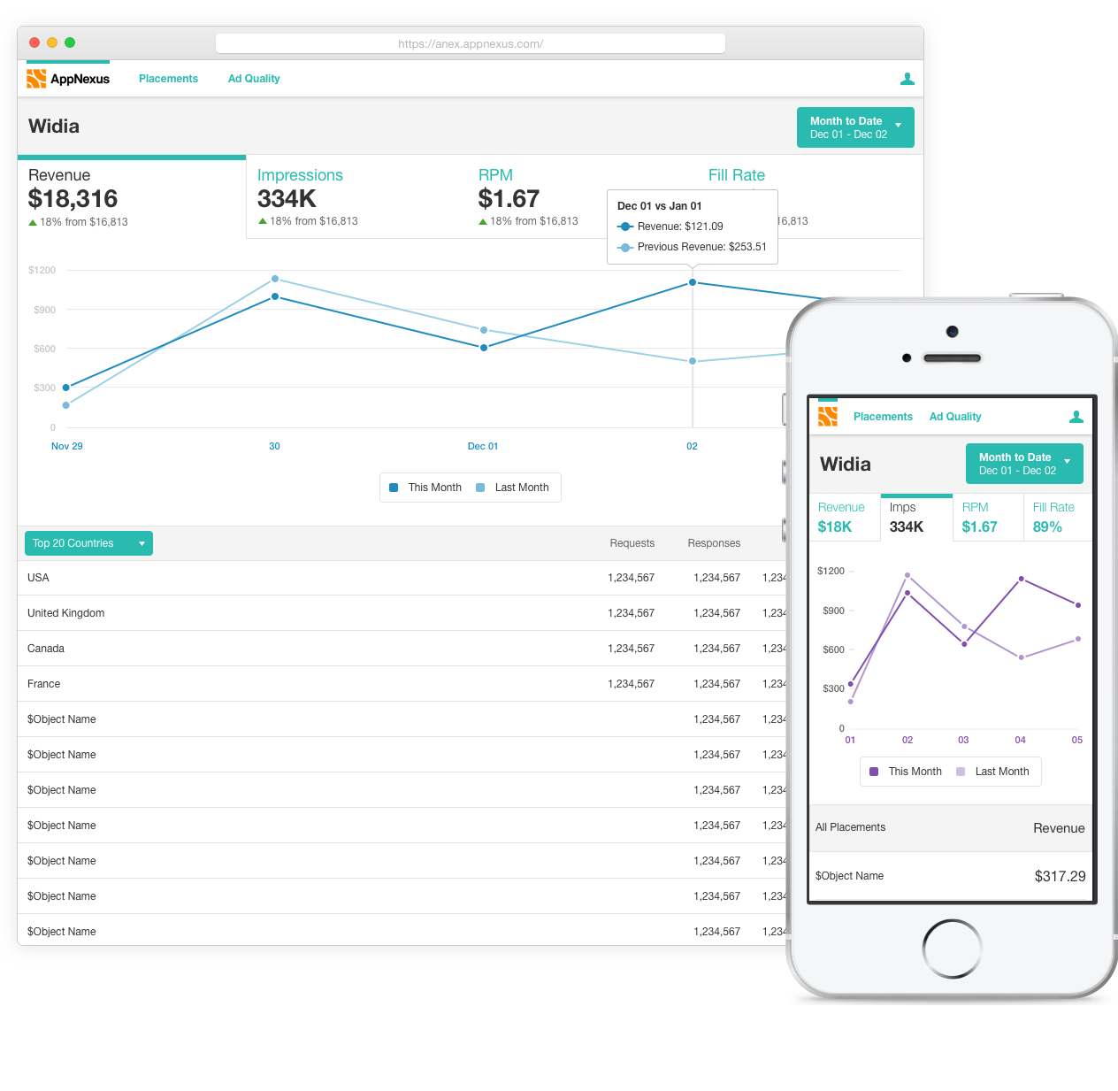
The initial understanding of header bidding users was driven by talking to internal stakeholders: sales, support, monitisation experts (The team that helps publishers optimise their advertising setup) and a few employees who ran their own sites. I focused on learning about which numbers and trends the user needs to evaluate AppNexus demand and to make changes to their site. The most important stats were revenue (obviously), RPM and the number of advertisement impressions they buy from us. They wanted to see these at a global level, as well as broken down by:
- Individual advertisement placement, to see if one particular placement is responsible for more income
- Brands buying advertising space, so they can reach out to advertisers and understand who their inventory is important to
- Country, similarly, to understand where their inventory is most valuable
- Placement size, so see if there are page design optimisations they could make.
Sketching and Low-Fi
I like to use a kick-off called a sketch session for the team. Anyone related to the team (developers, project managers, sales, commercialisation, support etc) was invited to a session where they sketches out their ideas. Over the course of the header bidding projects I ran about six of these. They're a great way to generate a lot of ideas quickly, get buy in on design, and make sure everyone is aligned around goals and requirements.

From there, to generate more ideas, I looked at some similar products from other industries. For example, apps for small retail shops (Square, Stripe, etc) were a rich source of inspiration. To make sure I was staying on goal with a realistic design I shared designs early and frequently with the development team and the director of the capability over slack or in person. In the end I decided on two options to explore at higher def.
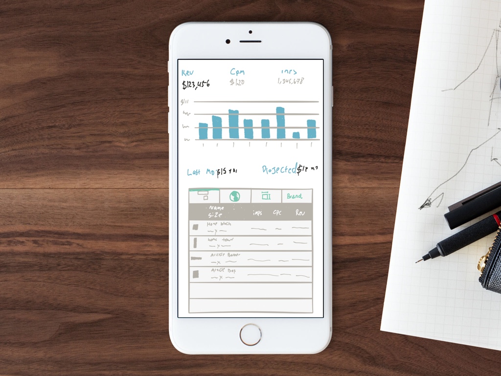 Final Mobile Sketch
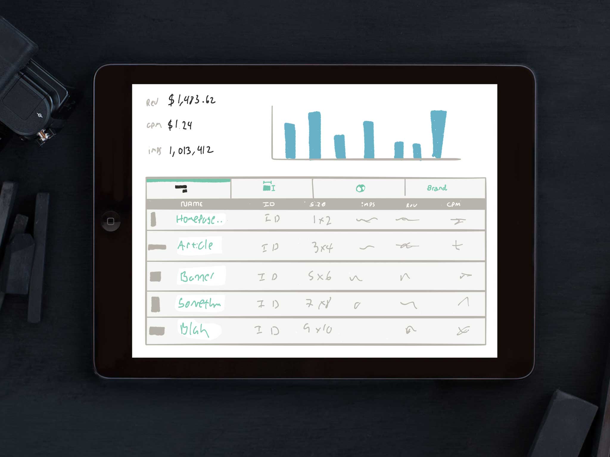 Final Desktop Sketch
Higher Def
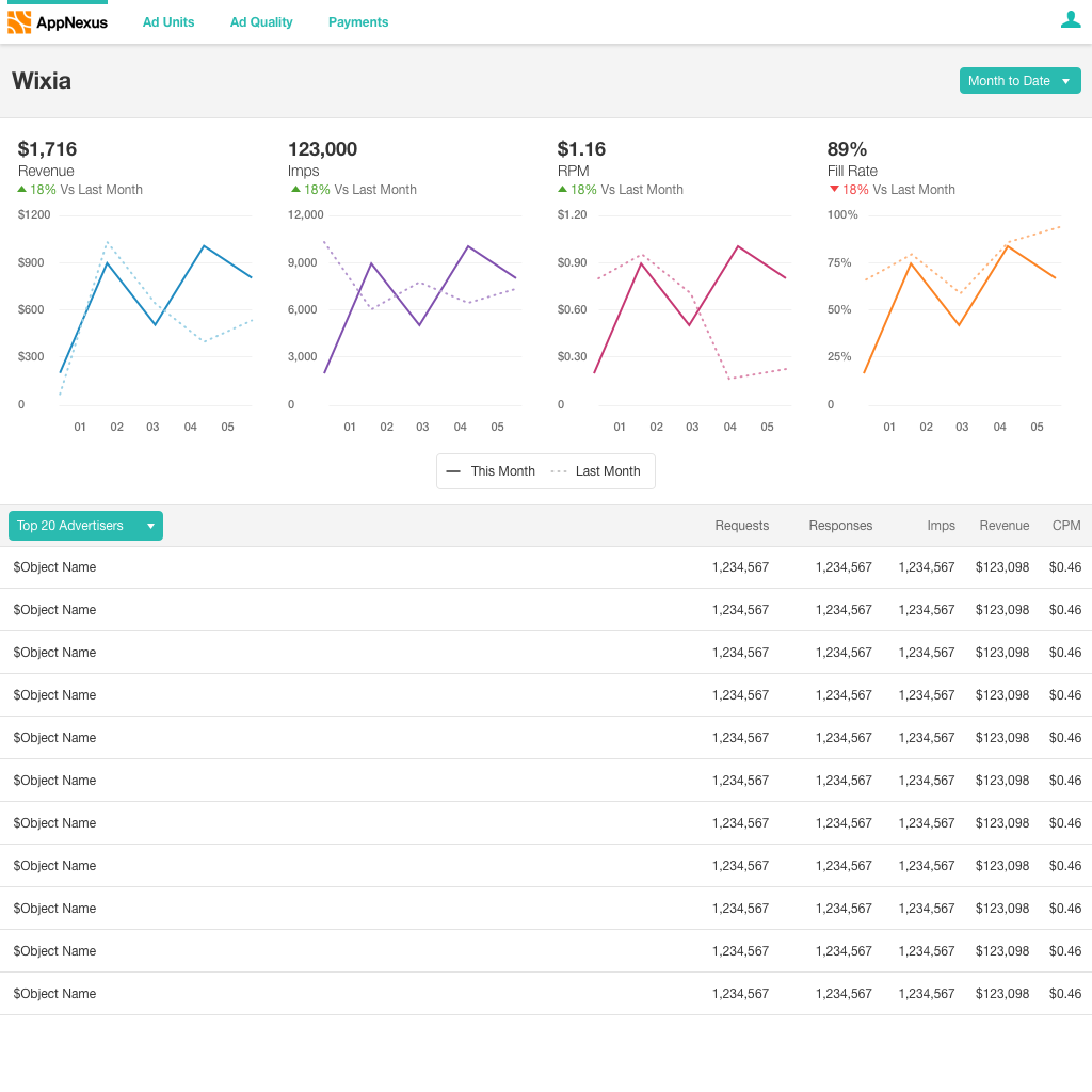
As I moved to higher def I learned a few new things about our users and made the following changes:
- Another stat, Fill Rate, was important to users and was brought in.
- The icons for the tabs were inscruitable, so I switched to a dropdown.
- “Last month” data was brought up to always be visible and allow for a trend arrow.
- The column with placement shapes was removed when it turned out that they had no defined shape.

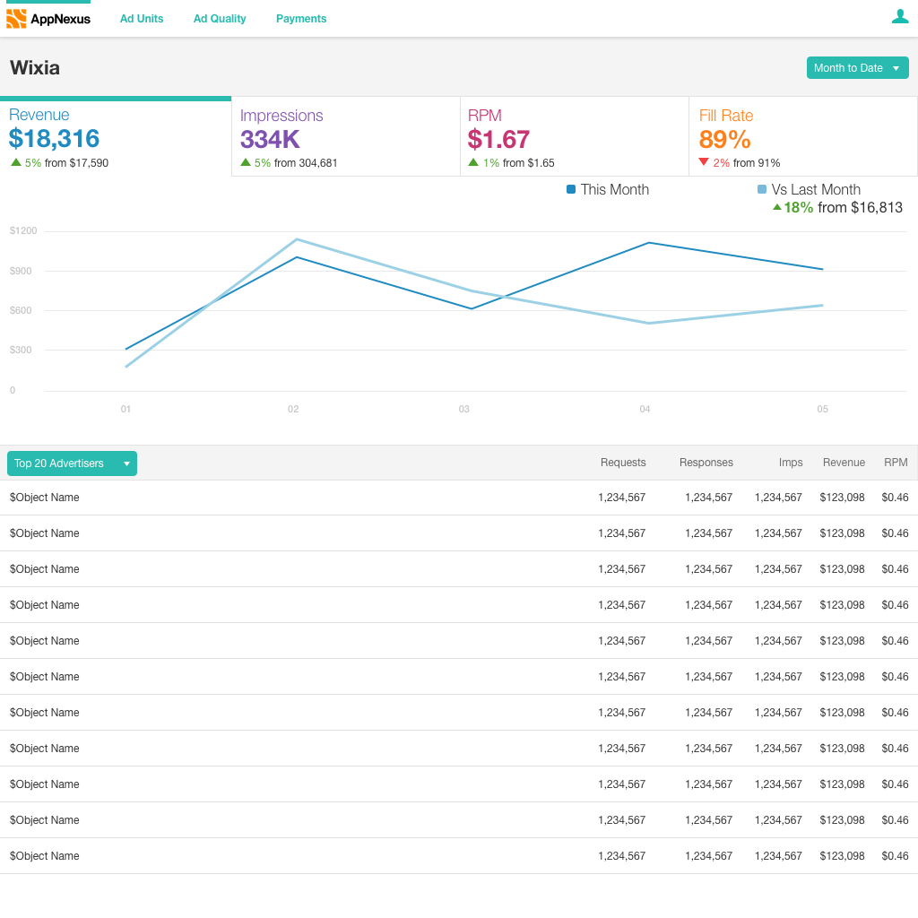
Usability Evaluation
The researcher and I chose one of the directions to test since we had limited time with participants.
A Marvel prototype allowed us to get testing quickly. Participants were able to understand all of the metrics, and would be able to make most of the decisions they needed to based on this design. Overall, the feedback we received was that they liked this as a base, but needed more features to get a full overview of their performance. The number one request was more control over the date range.
At the same time I was doing some experiments in Framer for choosing between two interactions (click the logo to switch between designs). In the end I decided on a single graph to help the user focus.
Placements Management
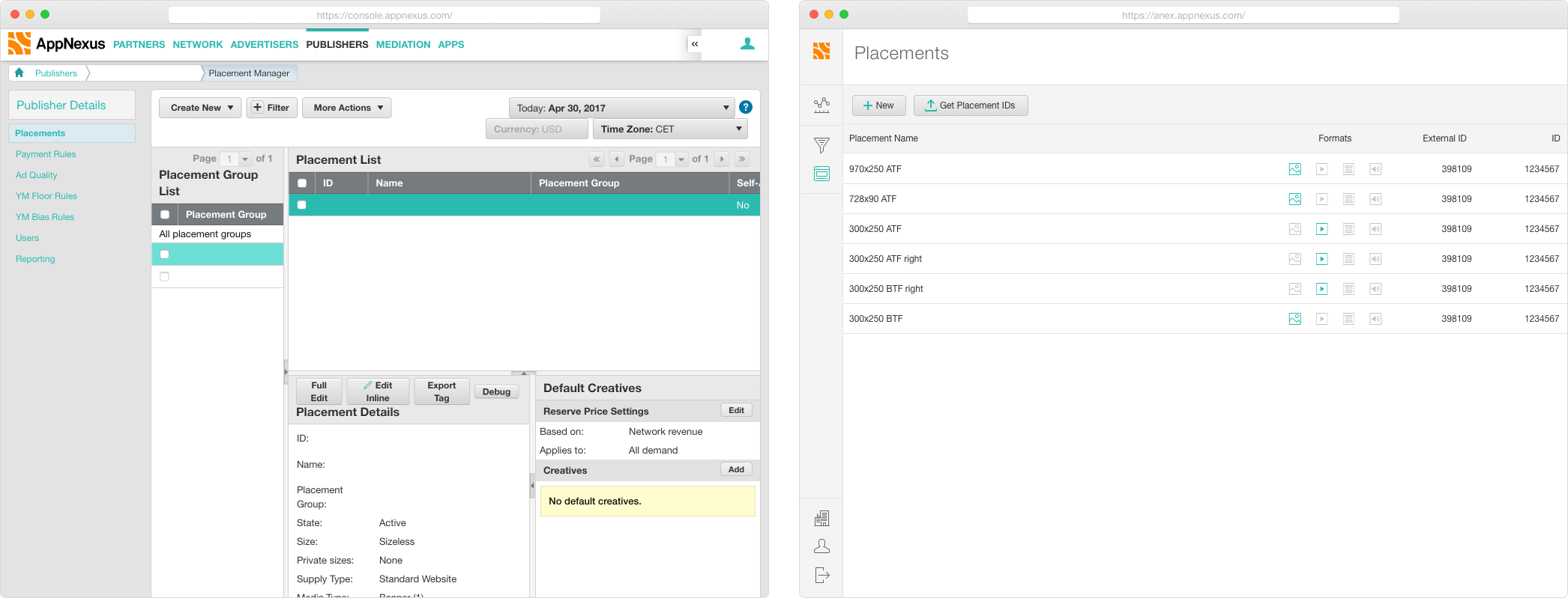 Left: Original enterprise version. Right: New, header bidding customer version
Our placements screen was too complex for medium or small publishers to understand and contained many features not necessary for header bidding clients. My goal was to simplify the placement management screen to just the these clients needed and then quickly iterate.
The first challenge around this was getting alignment on features. This required talking to multiple stakeholders. Product confirmed that our target was just header bidding clients. From there, I worked with the implementation consultants to figure out what the user needed to set up their campaign. Once this research was done I socialised this with the rest of the stakeholders and was able to get started on the design process!
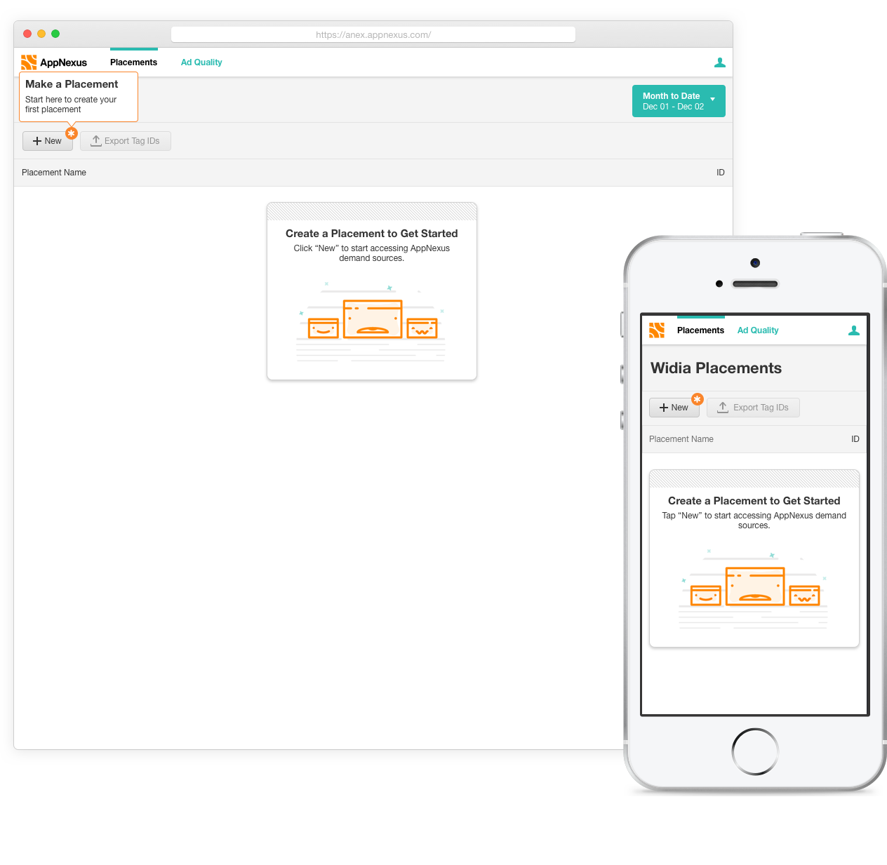
Version One: MVP
The design research for the placements page was mainly getting a technical understanding of how users set up their placements in header bidding. It turned out that users only needed two pieces of data per placement, a placement name and an ID.
Users had two main tasks for managing placements, creating them and then exporting their details to use in their header bidding setup. You could conceivably include monitoring performance here but those tasks were covered by the dashboard instead. I decided not to duplicate them on this page to follow the principle of focusing on simplicity.
Once these requirements were clear I set up a collaborative sketch session to kickoff the project. This generated a variety of ideas and helped get everyone excited about solving user needs.
For the general layout of the page I followed our standard pattern of actions on top of a table. Where things got more interesting was with creating and editing placements. The standard AppNexus patterns for creating and editing were taking the user to a new page or using a dialogue. After exploring those directions it was clear they were not a great solution for what was essentially a single form field. Instead, I worked on an in-line edit.
This lead to a few questions around micro interactions as well. There were many options for getting to an edit mode, such as an edit button or check boxes with actions. I explored those but they added unnecessary complexity to the page. Instead a click on the placement name would make it editable. Clicking elsewhere on the row would not so that they could easily copy and paste IDs. This seemed like a learnable interaction and kept with the simplicity principle. Initially the design called for auto-saving, but after talking to other designers it was decided that a save and cancel button would be better in case the user made an accidental edit.
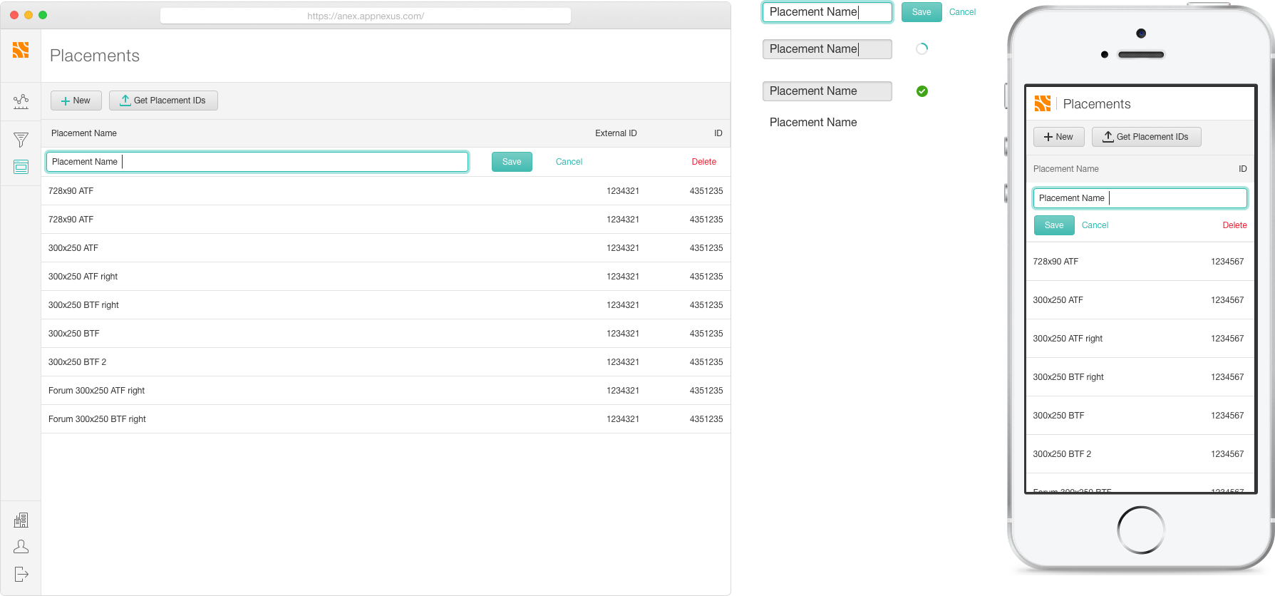 The initial version of the placements page, with a newer version of the navigation
Testing
I worked with researchers to plan a test for creating and editing a placement. We decided to use Marvel (a click through prototype app) since there were few complex animations. Clients were asked to create a new placements and all three finished without trouble. One said it was “much easier than [AppNexus'] competitors.”
Version Two: Formats
The second iteration involved allowing users to choose the types of demand they wanted for each placement. We had to allow users to select between display, video, native and audio. This lead to another round of exploring the AppNexus create and edit patterns. They still didn’t seem to fit, so instead I added another column to the in-line edit. When displaying the new data listing all of the formats would require too much space. Instead I used icons (designed by another team member) in the table. Some of the concepts (Display, Native) are difficult to convey in an icon so we also added tooltips to explain them.
Visual Design
Targeting a new, less sophisticated, user type meant that our visual design strategy needed up be updated. The traditional AppNexus styling felt too overwhelming and complex to header bidding users. As such, we wanted to focus on making it feel more approachable and simple, yet still powerful and intelligent. To keep moving quickly, however, we wanted to reuse as many components as possible from the component library.
Left (or above) you can see some experimentations venturing between our enterprise patterns (dark table headers and grey backgrounds) to a more custom look. In other locations I've also experimented with bringing in illustrations and having multiple bright colors on the graph. User research found that these made the product feel less powerful.
In the end a white background helped the product feel approachable and powerful. Actions and selected object followed the AppNexus pattern of being highlighted in teal, which made reusing components easier. Occasional orange highlights helped the product feel friendly without being too playful.
As we progressed through releases we moved further in the minimalist direction. The ‘Final Designs’ section below shows some pages from our initial release with a grey heading and a contrasting white navigation. The second revision can be seen in the completed placements screen section above. We moved the nav to the side so that the user could see more rows at a time. Then the header was simplified to a lighter font on a white background, more inline with the design direction.
Users said the new style felt "Way easier than doing things in [the enterprise product]"
Final Designs
Our header bidding product was a success at AppNexus, both for users and as a design process. Clients have enjoyed it and co-workers have called the collaborative process a "model engagement" with the UX team.