Jello Dashboard - Helping Users Understand their Performance
Background
Changes in the display advertising market made it easier for publishers to work with more sources of demand (advertising-lingo for sources of advertisements). AppNexus needed a simple new product for smaller publishers to access our demand, which is currently code-named Jello.
Our goal was to allow people to understand how well AppNexus demand was performing for them without requiring the support of Account Managers.
Explore a click-through Marvel prototype to get a better idea of the interaction.
My Role
When Jello started the product was a small experiment. With limited support team members playing multiple roles. In addition to being the lead designer I also took on some of the product management tasks. Overall this included working with the research team, getting requirements from stakeholders, helping to plan the roadmap, and owning the final UX and visual design of the product.
Tasks
- Requirements gathering
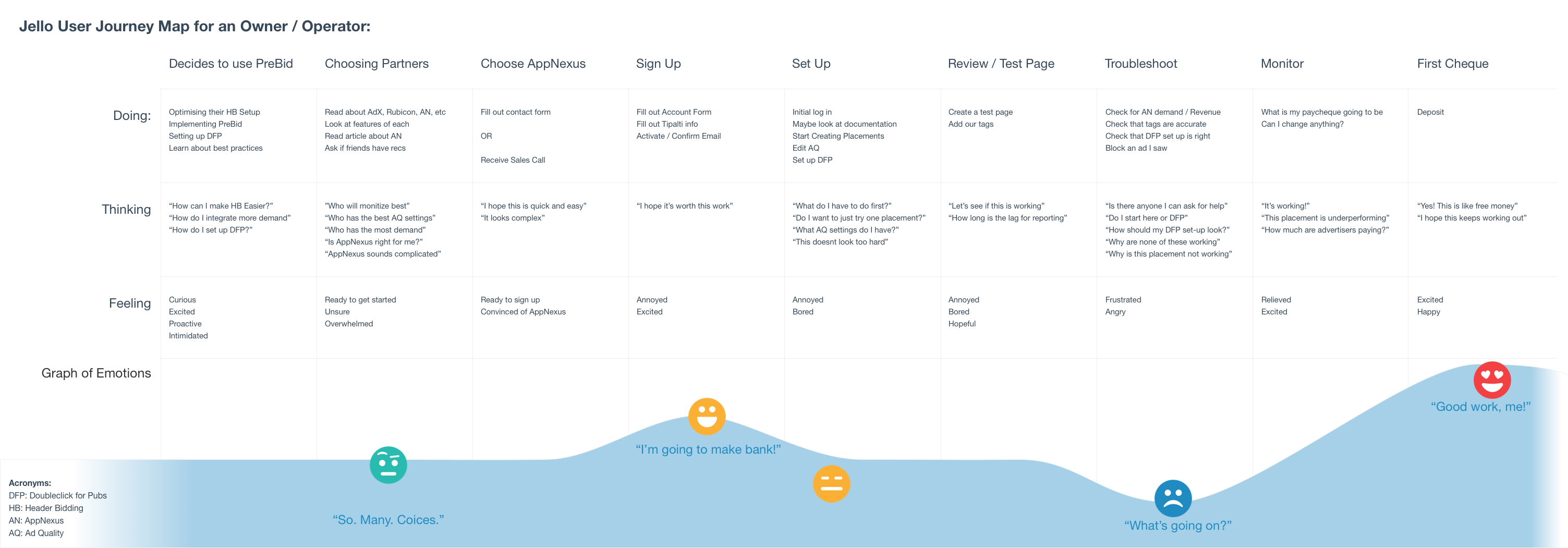
- User journeys
- User flows
- Participatory design sessions
- Prototyping
- Pixel-perfect mockups
- Design reviews
Design Research
Jello was a completely new product, with a new user type, which meant we couldn't use our regular research roster. It's also requires a certain level of knowledge to use, so we couldn't interview people on the street. As such, the initial understanding of users was driven by talking to internal stakeholders:
- Sales
- Support
- Monitisation experts (The team that helps publishers optimise their advertising setup)
- A few employees who ran their own sites.
I focused on learning about how the users evaluates AppNexus demand and then makes optimisations to their site. The two primary work flows were as follows:
- “How is my business doing on AppNexus - How much money am I going to make”
- “What optimisations can I make to my site to make more money”
I learned that the most important stats for both of these tasks include the following:
- Revenue
- The number of advertisement impressions bought from us.
- RPM - how much they make per impressions
They wanted to see these at a global level, as well as broken down by the following:
- Individual advertisement placement, to see if one particular placement is responsible for more income.
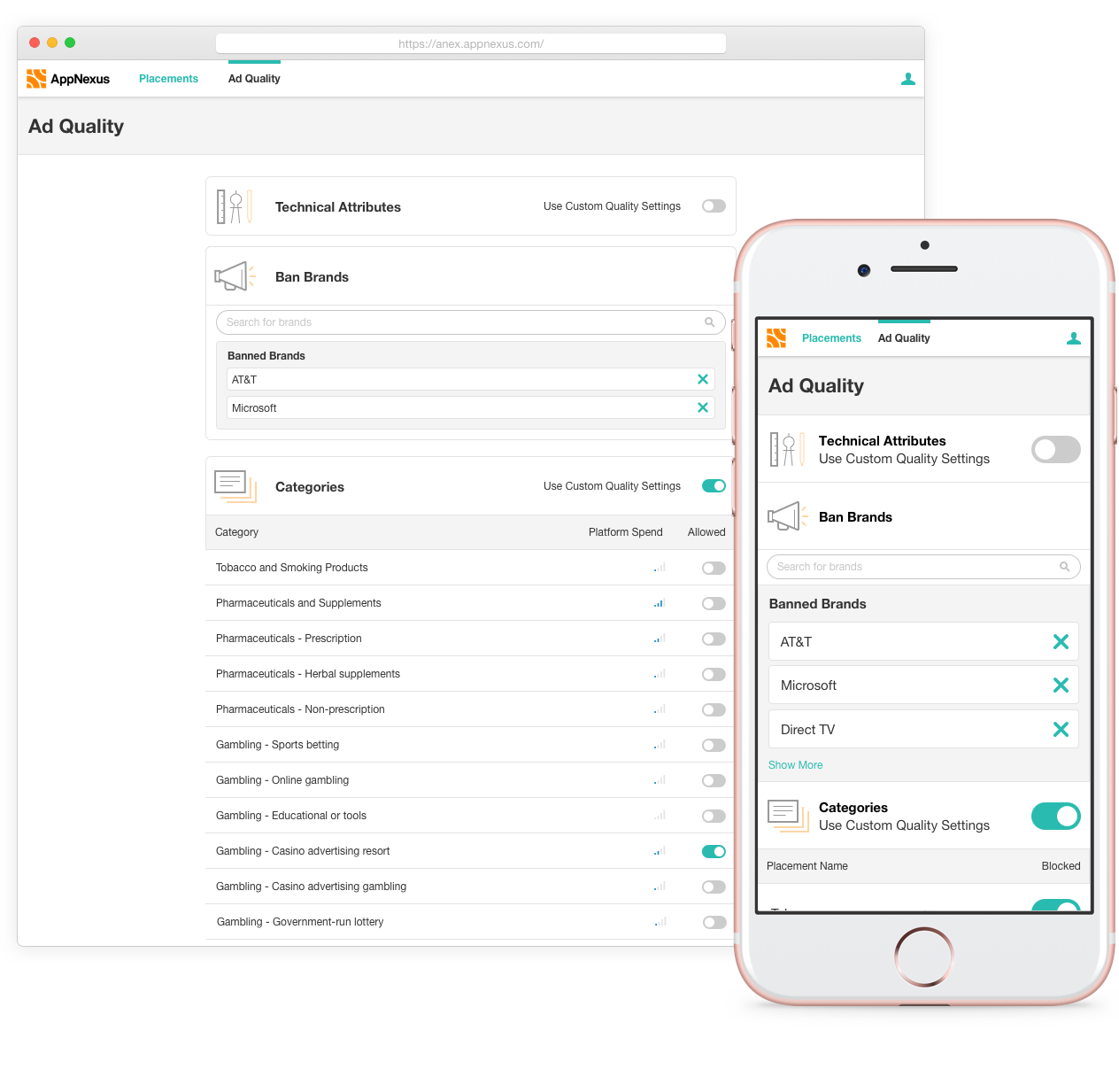
- Brands buying advertising space, so they can reach out to advertisers and understand to whom their inventory is important.
- Country, similarly, to understand where their inventory is most valuable.
- Placement size, so see if there are page design optimizations they could make.
There were also several lengthy technical conversations to understand exactly what the minimum requirements were for a publisher to be able to run our ads on their site. It turned out to be a lot less than our enterprise product. For example, have a look below at the difference between the enterprise version of the placement manager and the Jello placement manager
Design Process
Sketching and Low-Fi
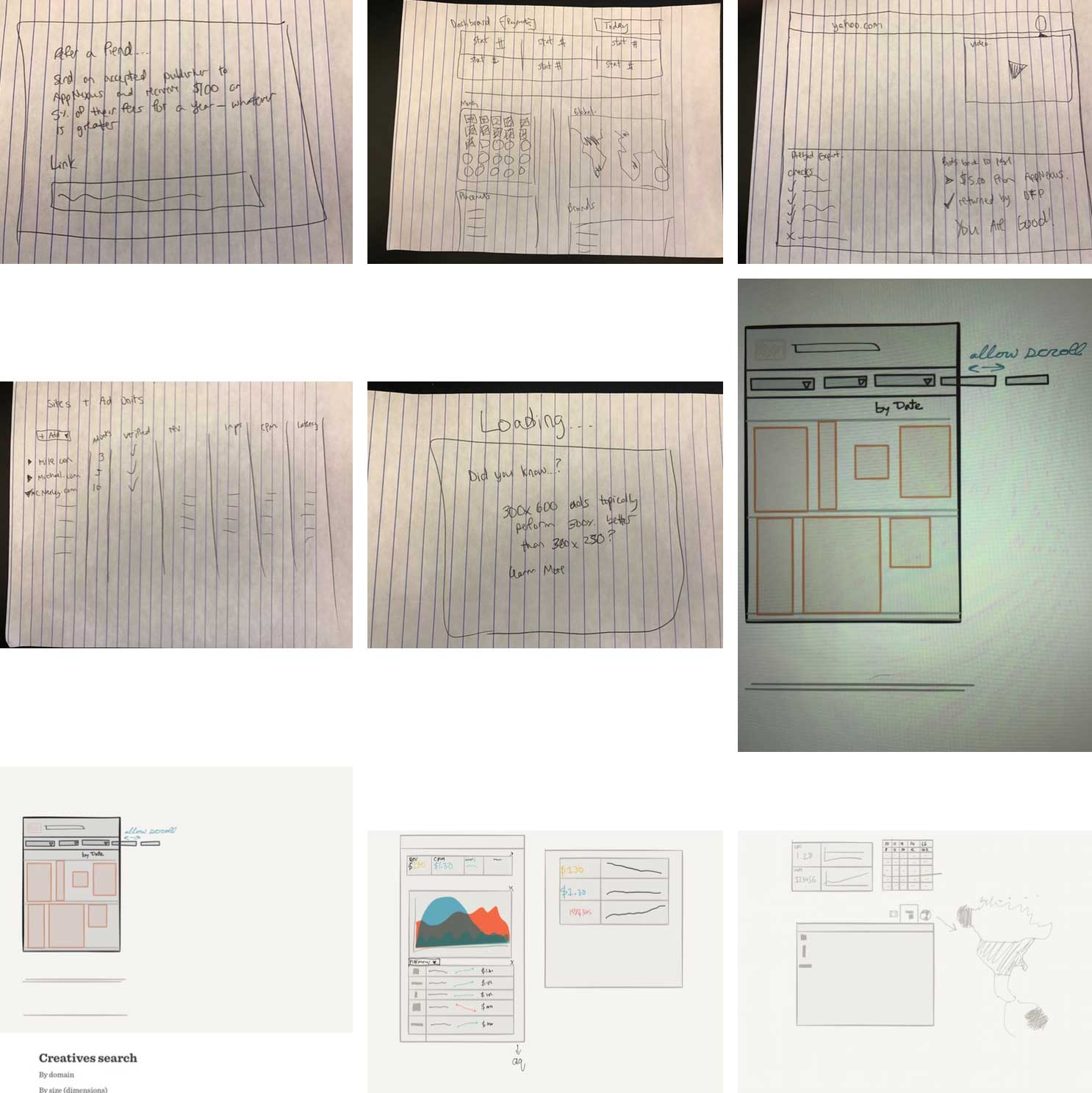
I've started the design process of every Jello project with a collaborative design process called a sketch session. Anyone related to the team (developers, project managers, sales, commercialisation, support etc) gets invited to a session where every sketches out their ideas. They're a great way to generate a lot of ideas quickly, get design buy-in and make sure everyone is aligned around goals and requirements.
From there I looked at some similar products from other industries (following the suggestion from the GV Sprint Lightning Demos). For example, Square and Stripe’s apps for small retail shops were a rich source of inspiration. Once the research and brainstorming were complete it was time to start answering the user’s questions.
How much money am I on track to earn?
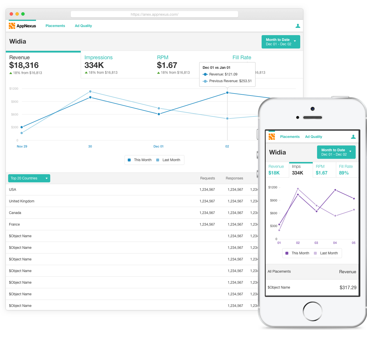
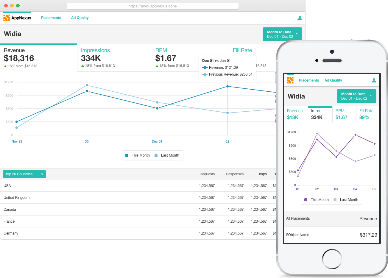
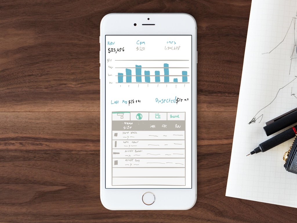
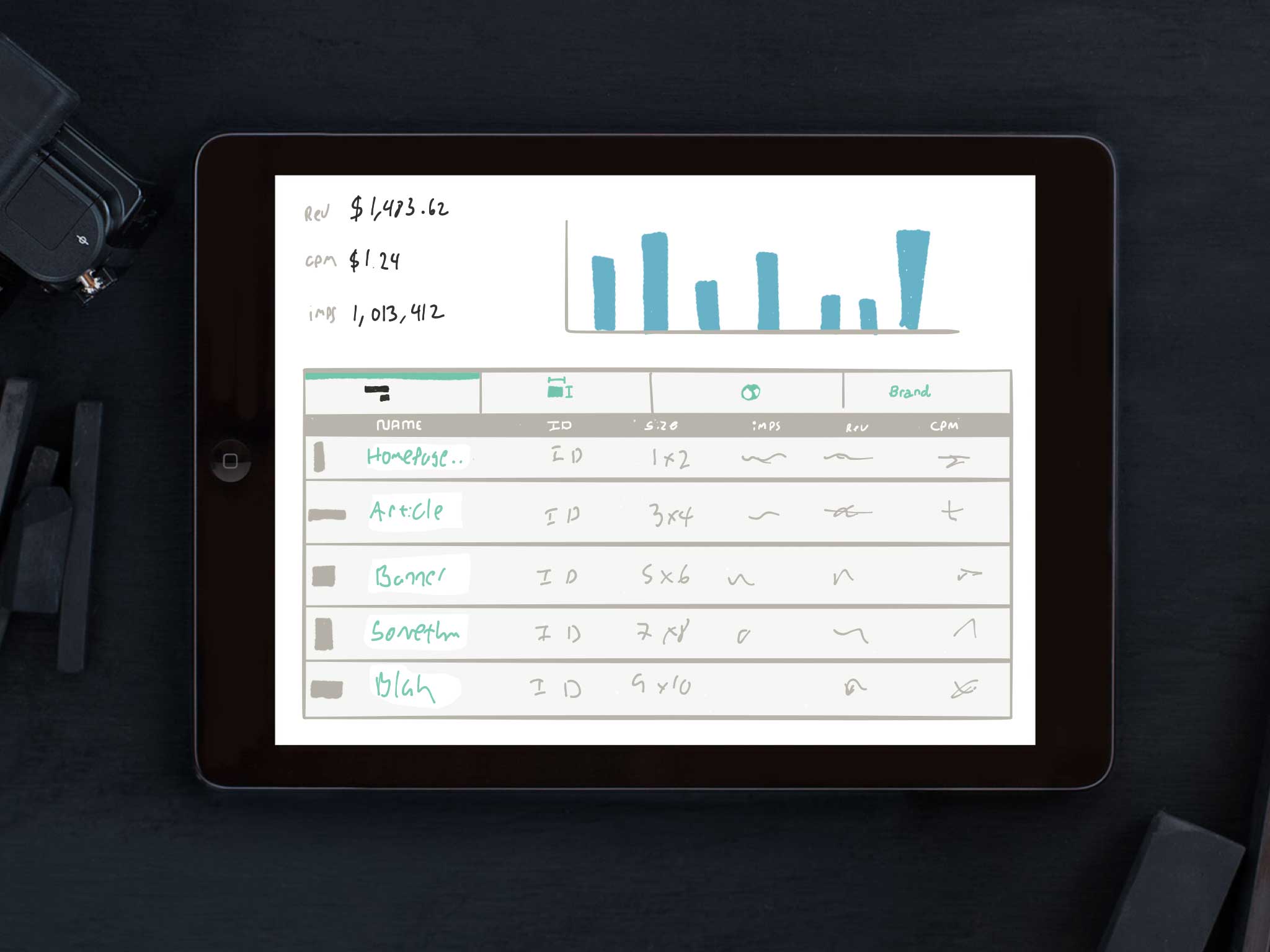
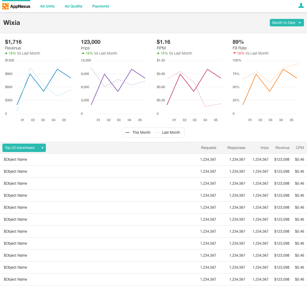
This was the first question the user was answering when they came to the page. It also included questions about performance over time - “Am I improving?” To solve this, I created the a chart that the user could switch between the important stats. This allowed them to see their revenue daily, and then also dive in a little further if something seemed amiss.
How can I make more money?
Below the overview was a more detailed table view broken out by different groupings. This is where they would start doing analysis to see if there were improvements they could make. Their main form of optimising was around editing and arranging placements, so the first table we shipped was their data broken out by placements. The next release will include breaking out their data by advertiser (or “brand”) to allow them to start striking strategic deals.
Higher Definition
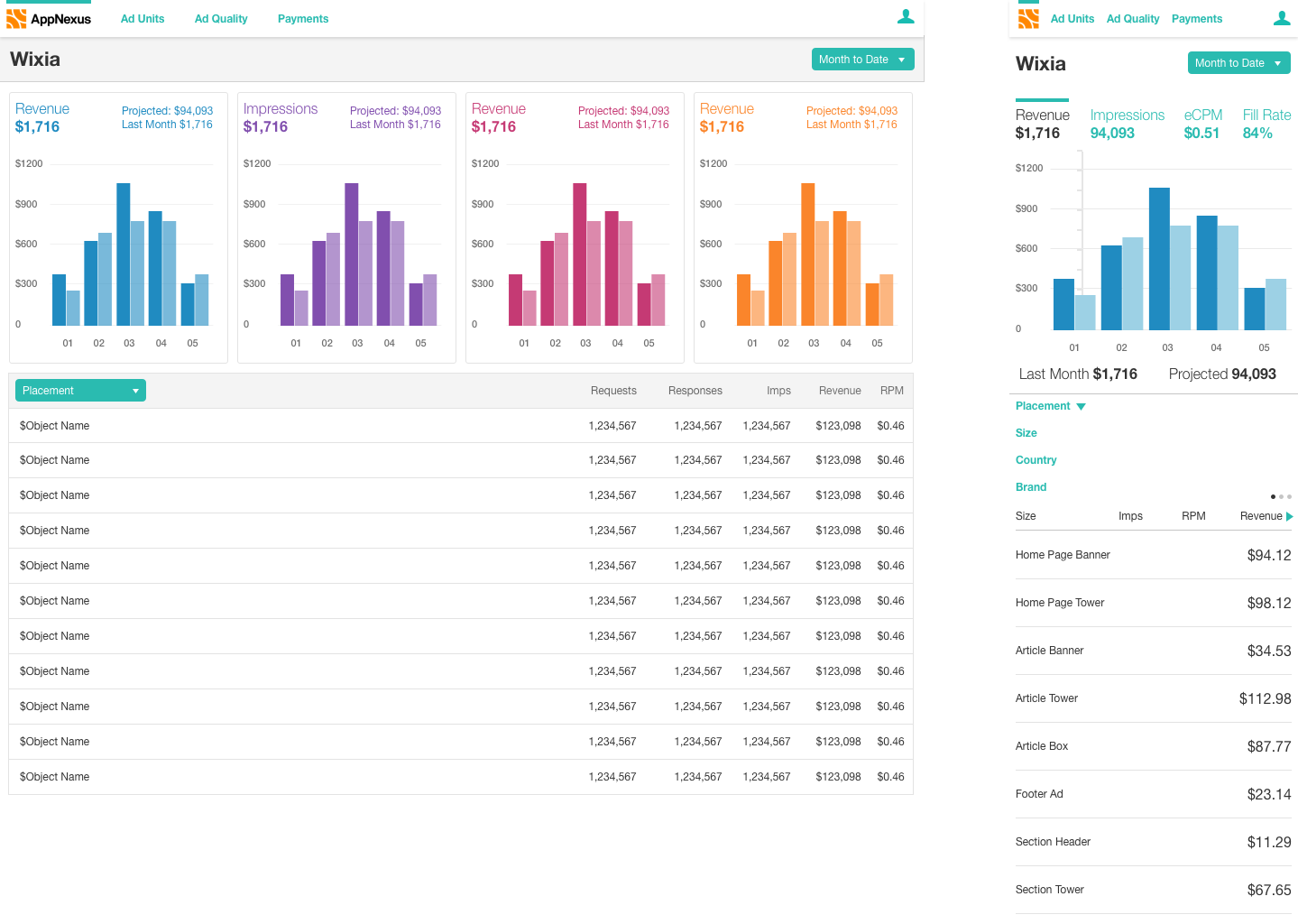
I built out the ideas I liked in Sketch to get a sense of how they would feel with our components and how much space they needed. At the same time, I was also learning things about our new user type. As such, I made the following changes:
- Another stat - Fill Rate - was important to users. It lets them essentially know how reliable we are with ad serving.
- The icons for the tabs were inscrutable, so I switched to a dropdown.
- “Last month” data was brought up to always be visible and to allow for a trend arrow.
- The column with placement shapes was removed when it turned out that they had no defined shape.
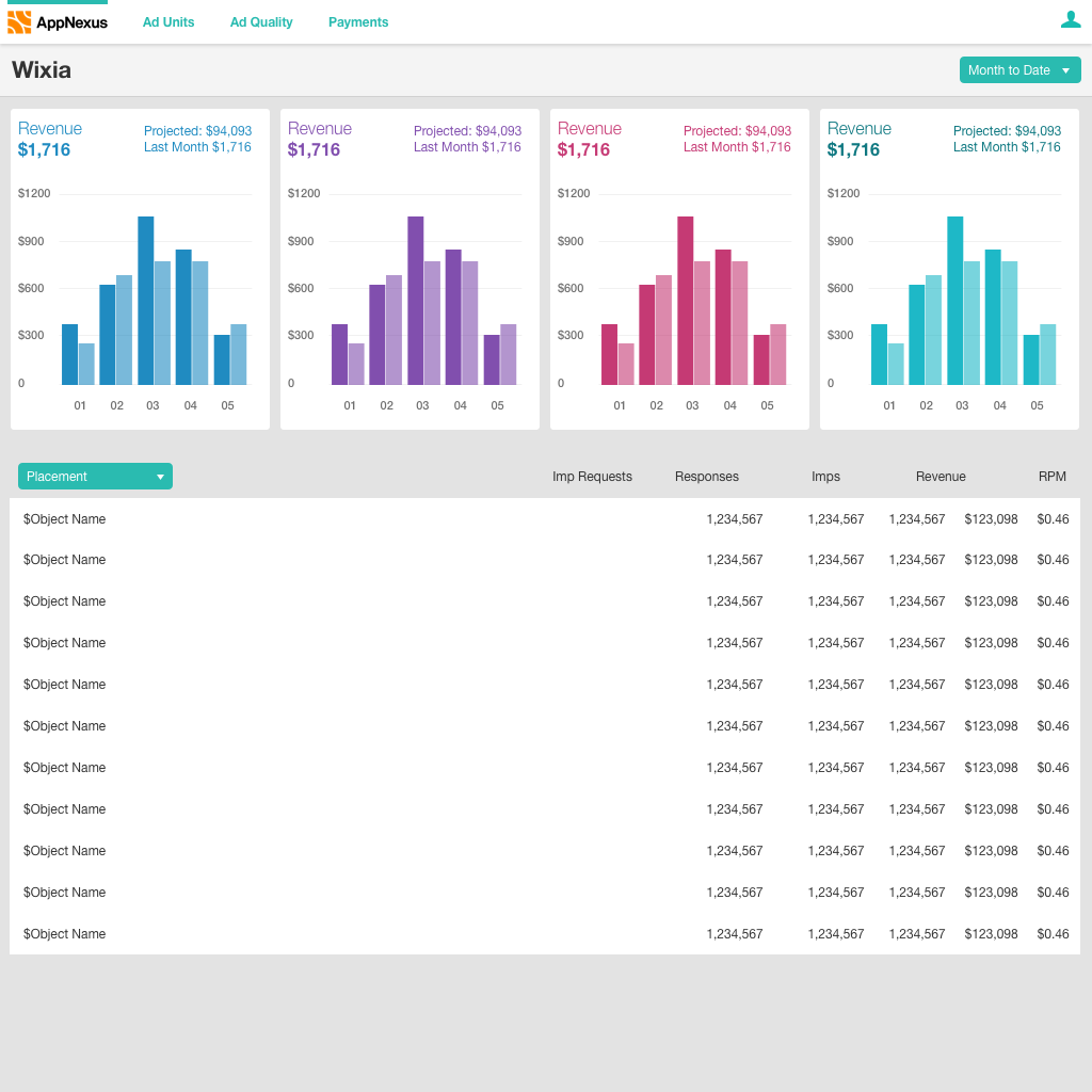
- On desktop there was a lot more room that we expected so I started experimenting with showing more graphs on the page
Prototypes and Usability Evaluation
At this point I worked with our researcher to plan usability tests for the designs. A Marvel prototype allowed us to get testing quickly.
We tested with four participants who all gave positive feedback, saying they liked the tabbed charts and found them easy to understand how they were doing. They also said the table data covered the types of data they would use to optimise. There were, however, some areas that could be improved. The primary request was more control over the date range, since they may need specific loopback periods. We also heard from one user that they would like to compare multiple graphs at a time, which we are currently working on validating.
We also asked them about another part of the site, placement management. This is where users would do much of the set up required to access our demand. One participant described it as, "way easier than competitor's products".
At the same time I was doing some experiments in Framer to choose between two interactions for choosing either a tabbed approach or a swipe approach (click the logo to switch between designs). In the end I decided on a single graph to help the user focus on evaluating one metric at a time.
Visual Design
We primarily rely on our component library for our enterprise product. In the case of Jello, though, there were two challenges that meant I had to make a few deviations.
Firstly, AppNexus' main focus is enterprise customers, and thus has a market perception of being powerful, but difficult to use. This meant that the main goal for Jello visual design was being more friendly and approachable while still re-using as many components as possible.
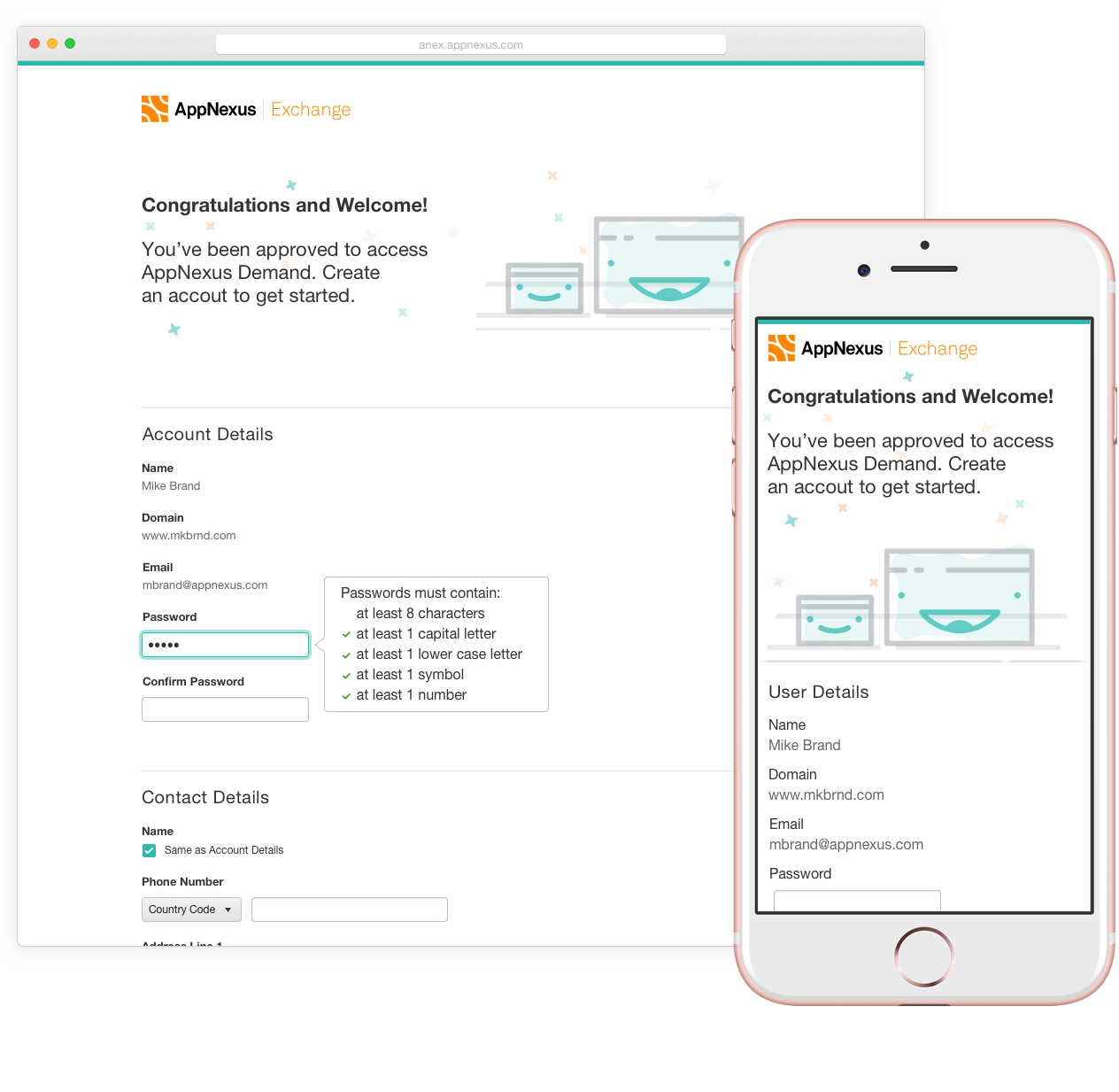
For the dashboard I focused on keeping more white space, using a few more colours, and keeping the page layout as simple and focused as possible. I’ve also been experimenting with bringing in illustrations, which you can see below in the account creation flow in the ‘final designs’ section.
Secondly, this was AppNexus' first time making a mobile friendly product which required some new layouts. One of our design patterns is grouping like content in white panels on a grey background. For mobile I wanted as much space as possible to be able to fit long object names and data, so I looked into removing the containers. This lead to more white space, fitting with the overall goals.
You can see some experimentations venturing between our enterprise patterns (lots of grey backgrounds and panels) to a more custom look that fit the goal more.
Final Designs
Jello has been a very successful product at my company, both as a product and as a design process. Clients that have used Jello have enjoyed it. It's also been called a "model engagement" with the UX team by the head of the capability, as such more of our UX designers have been trying the sketch session process.
