Trader Home - Surfacing Actionable Information
The Problem
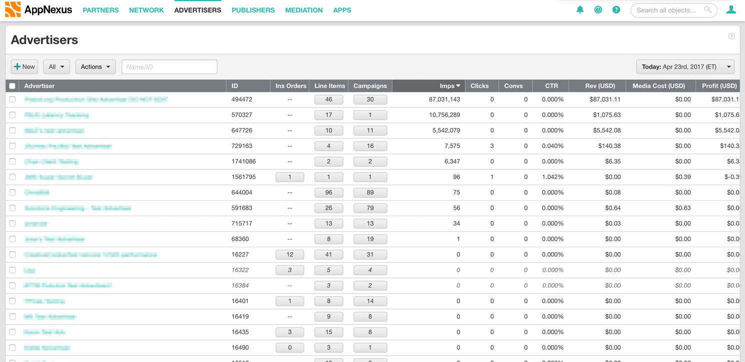
I was tasked with designing the new log-in landing page for our “traders” - users who traffic ad campaigns all day. When they logged in previously they saw a list of all of the advertisers that their company worked with. They then had to sort through all of these advertisers to find the ones that they actually worked on. Once they were in their advertiser they then had to run a report to see how each Insertion Order (IO) was performing. This was a long, slow, painful process, three of the worst words for enterprise software!
The goal of the project was to help the traders triage IOs , and then get them to where they could make fixes as quickly as possible. To do this, we created a personalized home page which surfaced the IOs that traders cared about and highlighted the ones that needed their attention.
Research and User Needs
Top Priority: Delivery
We started out with two types of research. One was looking at pre-existing research our company had. This consisted mainly of our internal personas and some documented ethnographic research. There was one persona, Nick Webster, who helped guide what further research we would need. Nick's main concern was “delivery” - spending all of the money he is given. If he doesn't do that his budget will get cut.
From there, we needed to know more about how the traders evaluated delivery. Our main focus was also a slightly different user type from what Nick Webster had been based on, so we also wanted to confirm our internal knowledge. I helped plan ethnographic observations of our most important client, and some of our internal traders. We planned to arrive as they started their day so that we could see how they prioritised their actions and how they evaluated their delivery (what numbers were important).
Delivery’s Main Metric: Pacing
From both internal and external traders we learned that the most important number for evaluating performance was “pacing.” Pacing is how much a campaign is spending relative to it’s position in the campaign. For example, a campaign half way through it’s life should have spent (at least) half it’s budget. Specifically they wanted to pace a bit ahead of the campaign’s position. If one was pacing below 100% then that was generally the first thing they would fix.
Step Two: Optimise
Once they’d made changes to any under-pacing campaign the next thing they would do is what’s called “optimizing” (referred to as “performance” in the persona). This is making sure people are clicking on ads or buying the product. We observed more differences in behavior here. Our internal users were very structured in how they approached optimising. After they had spent the morning fixing any delivery problems they would choose one IO to optimise. They would spend the afternoon running various reports (where ads were serving, time of day, segments of users etc) and then make changes to the advertising targeting. The external traders tend to be less structured and bounces around campaigns making various changes. One interesting thing we also noted for a separate project was that most users kept a personal change log of the edits they made.
Brainstorming
For this project a co-worker and I experimented with a design process called “Pair Designing.” It’s where all of the deliverables and research are planned and done together.
We started off by sketching different layouts for the information on the whiteboard. We wanted to be able to surface the IO that were poorly pacing. You can see some of the sketches below.
In the end we chose a card-based layout for a few reasons. Since we were targeting the user’s start of the day we figured mobile would be useful. The user could easily triage IOs on their way into the office, or quickly check in while they were away from the computer. Mobile has always been a tough sell at AppNexus. Talking through some of the ideas with engineers it became clear that cards made it easy to implement a responsive layout.
Once we had the page layout, we started exploring different card layouts. In all of them we were highlighting the pacing number, but there was still important secondary information: How long until the campaign ended and how big of an account it was. Later we also added in performance information for the optimising work-flow.
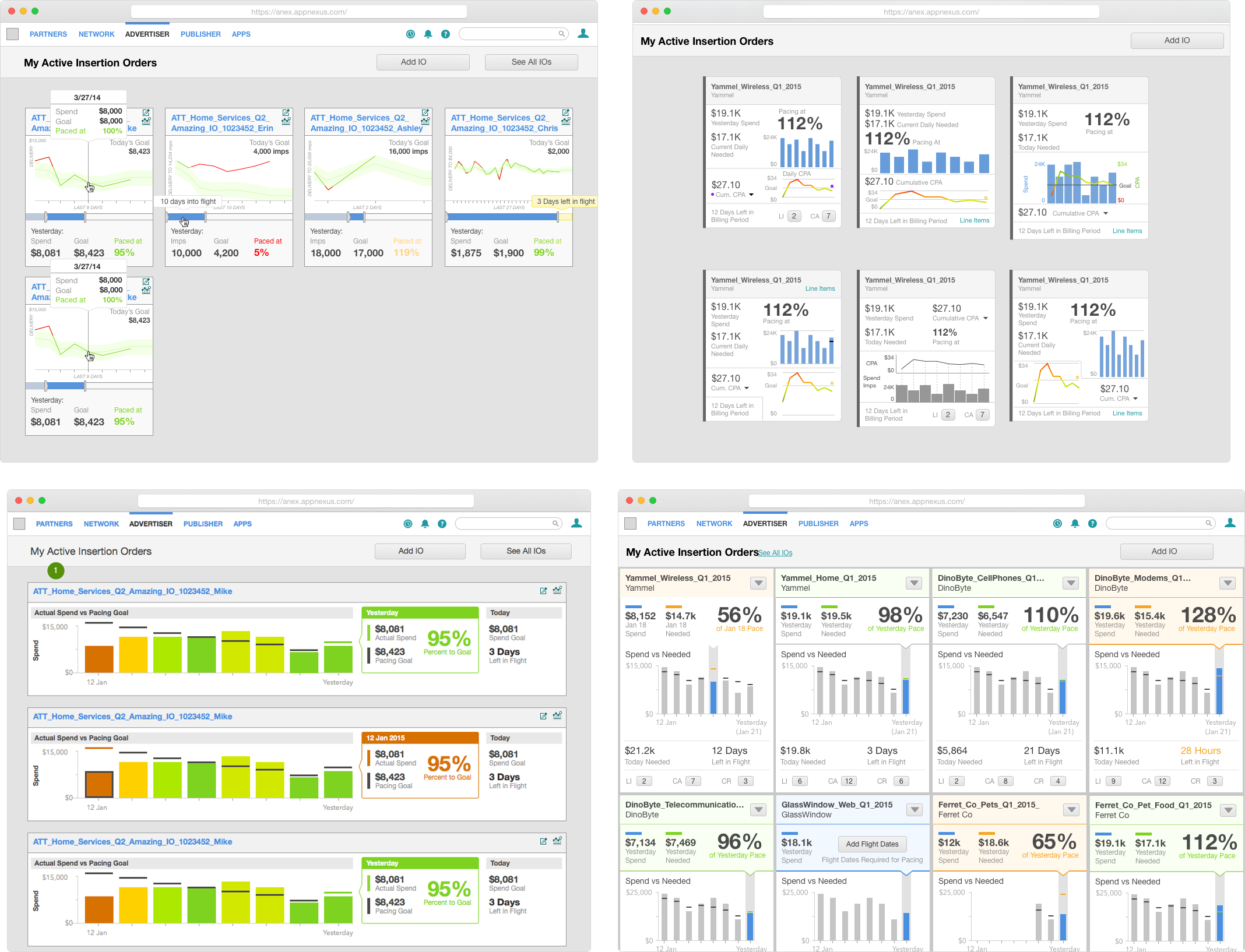
We experimented with a lot of card styles. Our focus early on was showing a graph of spend over time. We thought that this would add useful context how an IO was performing. At this point we’d frequently pop by the internal trader’s desk to ask them if they understood the graphs. The first (top left, above) visualisations we tried confused them. It was tough understand what the graph was showing, so we simplified it down to just spend. As we iterated we moved towards the bottom right above. It focused on the main information, and was colour coded to highlight which IOs were performing well and poorly.
User Testing
Once we got to a point where the internal users understood what was on the cards we worked with the research team to run a more formal usability process. This was focused around showing users prototypes and asking them how they would diagnose which IO needed the most help.
Here we discovered a few things about our prototype, which follow:
- The “success” colour was not helpful. The traders couldn’t figure out what the inputs were for deciding success so they mostly ignored it. This lead us to removing colour coding for IOs that had no delivery problems. The successful IOs could now recede into the background so traders could focus on the troubled ones.
- The graph was basically ignored. The historical context was not useful, what only mattered was going forward. This made it easy to remove the graph.
- Users loved the pacing number front and center.
- The red colour coding for under- and over-delivering IOs was appreciated by the traders. In every test they would go straight to the red cars and look at the pacing. One particularly successful moment was a user looked at the mockup and saw a red card that was passing at 76%. He looked VERY concerned and asked if the data was real, because if it was he had to go make changes to the IO right now.
We also asked what they would do once they saw an IO was underperforming. They said they would look at the child objects (Campaigns and Line Items) within it to make edits, so we gave quick links to get there.
The Solution
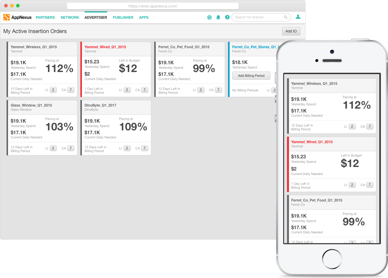
We removed all extraneous information, and focused on two things:
The first was surfacing the elements to triage IOs, as follows:
- The stats that were needed about the IO’s performance.
- The days left in flight so they knew how long they had to fix it.
- Color coding under-performing IOs so that they would draw attention.
The second was links to get them to where they could dive deeper once they’d decided what to fix.
When we showed the final product to traders they loved it. One of my favourite quotes was “This is the first time pushing a button in console has been fun.” It was so successful that companies began asking to be in the trial.


